You’re staring at a wall of text. It is dense. It’s overwhelming. Your brain wants to escape to TikTok.
Stop.
There are better ways to process information. This is called a concept map. This is more than just a pretty chart for teachers. It’s a graphical way of presenting concepts that forces your brain to do the heavy lifting of organization.
Think of it as the visual framework for your thinking.
Why you need to visualize your hierarchy
Most people take notes in a linear fashion. From top to bottom. From left to right. It seems productive to combine idea A with idea Z until you realize they have nothing to do with each other.
Concept mapping solves this problem by connecting ideas within a given topic. It classifies them. But it’s more than just grouping. This reveals a hierarchical structure followed by related ideas.
Let’s see what the bottom is. Let’s see what derivatives are.
“Concept maps help to clarify the steps that follow a certain process, especially in electronics.”
This is not an abstract theory. This is practical utility.
Breaking Down the Process
This is how it works in the real world.
- **Define your core concept. ** Center. Or above.
- **Branch. ** Draw boundaries for related ideas.
- Mark the ** line. **This is your secret weapon. Lines without labels are just spaghetti. Marked lines (e.g., “cause,” “reason,” “necessity”) create meaning.
This approach is important for understanding the steps in the process.
Take electronic products for example. You can’t just list the components. To turn on an LED we need to show how a voltage flows across a resistor. List creation fails here. The map was successful.
Who is this for?
It’s not just for engineers.
Students use it to analyze complex historical timelines. Parents use it to plan family trips, budget, dates and activities. Lifelong learners use it to discover new hobbies.
The goal is always the same.
** Understand the hierarchy that ideas follow. **
When you see the structure, you stop remembering. You start understanding.
The next time the facts overwhelm you, draw the line. Connect the dots. See the shape of the knowledge.
It is messy at first. That’s normal.
Concept maps have a bit of a boring reputation. Most people immediately associate them with college assignments, exams, and class summaries. And yes, that is its main function: clarifying complex information at a glance. But its usefulness extends far beyond the classroom.
In the corporate world, these diagrams serve a different but equally powerful role. A hierarchical concept map is used to visualize the structure of an organization. Show departments, authority levels and key positions without having to read hundreds of pages of manuals. It is a visual synthesis tool.
Academic origins of the technique
They didn’t appear by magic. They have a documented history. The concept was born in the 1960s thanks to David Ausubel. He was an American psychologist and educator. His work focused on the psychology of learning. Ausubel postulated that knowledge is built on what we already know.
Years later, in the seventies, Joseph Novak put theory into practice. Also an American researcher, Novak applied these ideas to the design of educational tools. Their goal was to create effective methods for formal learning environments. Today, both the structure and the original intention remain in force.
Basic structure of the concept map
To use a concept map correctly, you must understand its components. It is not a random drawing. It has organizational rules that follow a hierarchical logic.
- Concepts : These are the main ideas. They are usually written within ovals or boxes.
- Linking words : These are the connecting lines. They explain the relationship between two concepts.
- Propositions : The union of concept + link + another concept forms a proposition with complete meaning.
The key is in the hierarchy. The most general concepts go above. The specific ones, below. This creates a network where information flows from the abstract to the concrete.
Application in professional environments
Why use it in a company? Because internal communication is usually chaotic.
A hierarchical concept map solves that. Allows you to see who reports to whom. Shows how different departments relate. If you have a large organization, this diagram acts as a navigation map.
- Identify the main roles.
- Establish authority connections.
- Visualize dependencies between teams.
This is not just for managers. It also helps new employees understand where they fit. Reduces ambiguity. Speed up integration.
Practical advantages for learning
Let’s get back to academics. Why do they work better than taking linear notes?
Traditional notes are sequential. The brain processes them in order. Concept maps are spatial. They activate other cognitive areas. By connecting ideas visually, you facilitate long-term memory.
Studying with this technique requires more initial effort. You have to analyze, select and relate. But the result is understanding, not just repetition.
It is not a solution
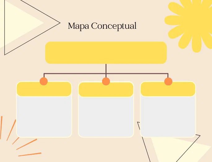
Building an effective concept map requires more than drawing boxes. It is an exercise in visual logic.
Three elements support it. Concepts. Link lines. Linking words.
If one is missing, the structure collapses.
Essential elements of the concept map
The concepts are the main pieces. They represent ideas. They are usually one or two word nouns. They are enclosed in geometric shapes. Rectangles. Squares. Ovals. Circles.
Write all the concepts first.
Don’t try to connect them instantly. First, list the ideas. Then, look for relationships. That is the function of the lines.
Link lines draw connections. They show how concepts are related. They order chaos. They create categories. They establish hierarchies.
Use arrows when you need to indicate order. Or subordination. Process flow matters.
The linking words clarify the ambiguity. Sometimes a single line doesn’t say anything clearly. This is where the keywords come in. Generally verbs. They are placed on the lines.
Concept + Word + Concept = Proposition.
Think of the Sun. Higher category: Star. Write “is” on the line. Now you read: “The Sun is a Star.” Visual and direct.
Characteristics of a clear concept map
A good map is not just pretty. Works.
It must meet technical minimums to be useful in learning or teaching.
Impact and visual clarity
Disposition matters. The structure must be organized.
The lines connect main ideas with secondary ideas. This favors quick associations between complex concepts. The eye scans patterns. If the pattern is confusing, the message is lost.
Hierarchical organization
The information is not mixed. It is hierarchical.
The most important concepts go at the top or in the center. They are usually highlighted in frames. They show relevance.
The information follows inclusion patterns. There are three key levels:
- Superordinate : Maximum level of inclusion. Main ideas.
- Coordinated : Same hierarchy. Equivalent pairs.
- Subordinates : Included in higher categories. Specific details.
This visual structure guides understanding. The brain processes what is above as general and what is below as particular.
Synthesis
Don’t write paragraphs.
Summary concept maps. They use keywords to define relationships.
This is not the place to delve deeper. Or to describe in detail. It is to associate ideas easily. If you need long explanations, use notes in the margin. Or a separate document. The map must be clean.
Pedagogical and corporate utility
Why use them?
They are tools of understanding. They facilitate learning by summarizing dense information.
In the corporate sphere, they are used to summarize projects. Or strategic issues. They allow you to see the forest without getting lost in the trees.
Types of concept maps
The organization varies depending on the objective.
There are four main types. They depend on how the ideas are organized.
- Spider map.
- Hierarchical map.
- Flow chart.
- Systemic map.
Spider concept map
This type starts from a central concept. You radiate everything from there.
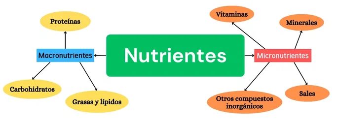
Spider diagram: center-out mapping
Think of the spider diagram as a visual focal point. Start with the core idea in the middle. Everything else branches off from there. This is not just a random note. This is a way of grouping related concepts together.
Most people put the subject in the center. Next, draw lines outward. These lines are connect to sub-topics. Each subtopic can be subdivided. This creates a hierarchy. It’s very simple. This works well. It’s everywhere because it’s effective.
Why hierarchy is important
Hierarchical mapping of data reveals relationships. We’ll see what you come together. You can see what is secondary. This structure helps organize your thoughts. Avoid confusion.
How to build
- Choose a key concept. Write this in the middle of the page.
- Identify the main categories. Draw the lines radially outward from the center. Label each line on each line.
- **Add sub points. ** Draw smaller branches from each main category. These are specific details or examples.
- Refine. Look at the whole map. Does that make sense? Move things around as needed.
The benefits of learning
This method is perfect for students. Turn abstract ideas into visuals. It helps with memory. Seeing connections deepens your understanding.
“Spider diagrams allow you to categorize concepts within groups and subgroups.”
It’s not just school. Experts use it for brainstorming. Helps solve complex problems. The key is to start simple. Don’t overcomplicate your first draft. Get the structure down. Then fill in the details.
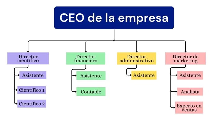
Let’s start from the top. Or the side. As long as you’re consistent, you’ll be fine.
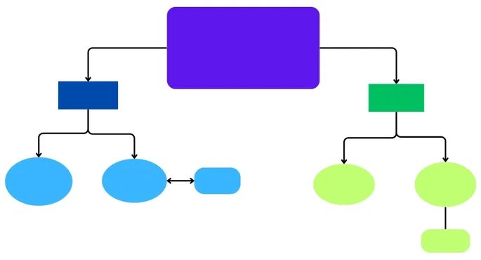
Hierarchical concept maps deal with vertical or horizontal flow. The main ideas are at the top. Everything else branches off from there. Each row represents a certain level of importance. Looking down, we move from the general to the specific. This hierarchy is maintained as you move to the right.
This creates a clean structure.
A logical descent.
Think of it as an organizational chart.
In addition to the relationship between superiors and subordinates, there is also a conceptual relationship.
“Each row represents the same level of importance or relevance.”
This format is ideal when you want to categorize data quickly. Reduces cognitive load. The brain does not need to search for the core. It’s there. It’s up there.
What is the difference between a hierarchy diagram and a flowchart?
Not all maps look the same.
The hierarchy is strict.
Flow-based maps are fluid.
A concept map of flow tell the story. It moves in a sequence. cause and effect. Step one. Step two. Step three.
Hierarchy charts are static. They show what the thing is and how it relates to the central theme.
A flowchart shows “how” something happens.
If you’re studying a process, use flow.
Use the hierarchy to explore the structure of the system.
When to use which?
Use hierarchy mapping to:
– Classification of biological species
– Breaking down company departments
– Organize learning topics according to subcategories
Use flowcharts:
– Troubleshooting a broken appliance
– Plan your project timeline
– Understand the order of chemical reactions
Intention is the key.
Do you want to see the tree? Or is it a river?
Sometimes they overlap.
Hierarchies can contain process elements.
However, don’t confuse the two.
Clarity suffers when you mix them.
Stick to one logic per page.
Keep it simple.
Make it easy to read.
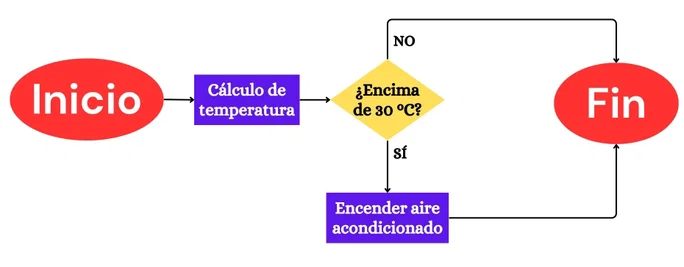
How to use flowcharts to build complex processes
A flowchart is more than just a diagram. This is the scheme of cause and effect. Let’s start with one step. Next is the next box. Then again. The goal is a specific outcome. This structure makes it indispensable in fields where order is important. Programmers use it to follow code logic. Economists describe market trends. Psychologists follow behavioral patterns. It turns abstract chaos into a visible timeline.
Why system maps handle higher complexity
The standard maps are organized by topic. The system map goes deeper. They blend the spider concept with linear flow. This hybrid approach is the key to the systemic conceptual map use case. It is more than just a grouping of ideas. You are sequencing them.
Most concepts in the system depend on the previous steps. A spider map shows static linking. A flowchart shows movement. The systemic version does both. It reveals how Category A initiates step B, which affects concept C. This creates layers of complexity that standard diagrams cannot handle.
“System diagrams combine categorical relationships with sequential order, allowing for visualizing ideas more complex.”
When to take a systems approach
Use this tool when your theme has both a hierarchy and a timeline. If you explaining a multi-stage process with branching variables, a simple flowchart might miss the connections. A spider map might miss the sequence. from the spider diagram. The systemic map fills that gap. It answers the “how” and “why” simultaneously. It shows not only what is connected, but what happens when they interact.